A Third Time with Charm
Thoughts on the Development of Filterstorm 3
When the last major update of Filterstorm went live, I still had a day job and Filterstorm Pro was nothing more than a concept. Indeed, it was that update — version 2.5 — which prompted me to quit and allowed me the financial stability to write FSPro . Of course, this means iPhone users who have been the majority of sales since 2.5 have not seen any major update, nor any update at all since last November.
Filterstorm Pro was never meant to be standalone. From day one It was considered the foundation of Filterstorm 3; a new, better project built with the lessons learned from the original two versions. When I started writing Filterstorm less than a year and a half ago, I had no experience with iOS. My initial naïveté would have caused problems had I continued expanding upon that initial code base.
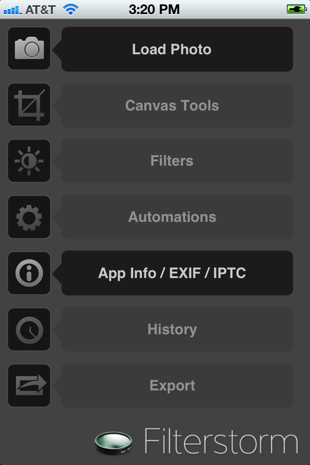
FS3 Launch Screen
Interface Introspection
With the release of FSPro two months ago, all my time since has been spent doing two things: eliminating the launch bugs FSPro, and working on FS3. Much of this work has already found its way into FSPro. Real-time previews, blend modes, split previews, and the color overlay mask view were all part of this process. Most of the work, however, has been on the iPhone interface.
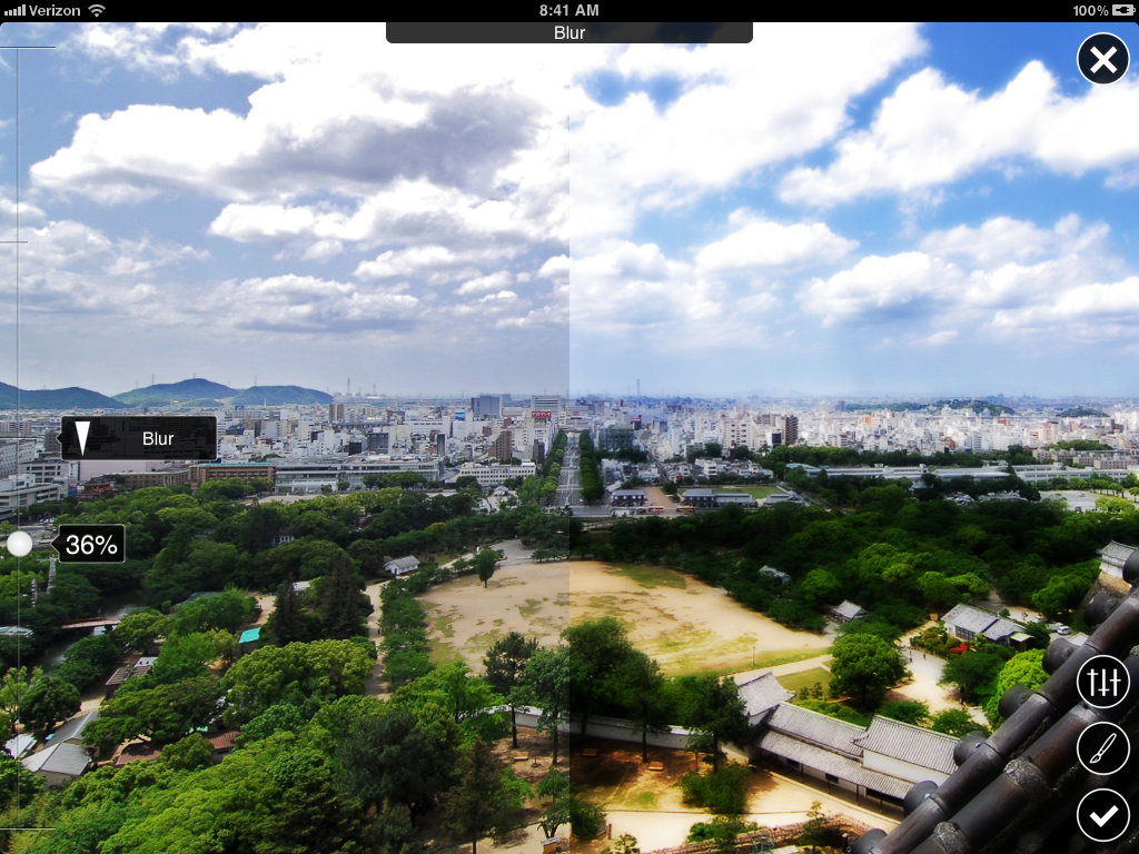
New Sliders on iPad (overlay blended blur)
Both iPad and iPhone get an entirely new interface with this release. The difference is that most of the work for iPad was already done for FSPro. Furthermore, iPhone’s interface was never nearly as good as that of iPad. The big problem was that iPad’s interface had basically been crammed in to fit on iPhone’s screen. It needed to instead be its own separate entity; it was finicky. Where the tab drawer was redesigned on iPad to be more space efficient, it needed to be eliminated entirely on iPhone. Where FSPro had kept something almost identical to FS2’s floating palette, it needed to be redesigned entirely on iPhone. In fact, I liked the new iPhone sliders so much that made a very late change (3 days ago) to the iPad interface and am now using a modified version of the new sliders there, too.
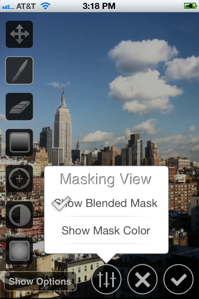
Popovers on iPhone
I decided to make my own popovers for use in FSPro rather than using the ones provided by Apple for two reasons. You can’t customize the appearance of the built-in popovers, and they can’t be used on iPhone. It was a great decision; popovers are fantastic on iPhone. They’re quicker than using modal sheets (the things that slide up from the bottom), and are perfect for displaying smaller bits of quickly-dismissed information and buttons.
Making the Grade
In my blog post for the release of FSPro, I stated several design goals which I’ll repost here:
- Reduce the number of taps and complexity of gestures required to do anything.
- Devote as much space to the image as possible
- Eliminate any unnecessary color from the interface as it may distort the perception of white balance
- All features should be easily discoverable
- Discoverable features may have less obvious gesture-based shortcuts for power users
B&W sliders no longer cover half the image on iPhone
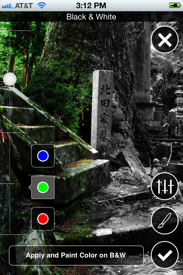
When applying filters, however, extra taps can be required to switch between slider settings. This was a tradeoff in order to accomplish goal number 2, to devote more space to the image, and the image remains big and beautiful when doing things like B&W where much of the image used to be covered. Other tools, like curves, take up the same amount of space as before, but the curve control itself is larger without covering more of the picture.
The last two points were less successful. I think things are a bit more discoverable than in FS2, the home screen labels I have added should help with that, along with better visibility of features. However, the learning curve is probably still higher than I would like it. I am always surprised when people don’t simply tap on buttons to find out what they do, and instead avoid them as they are unsure. Text documentation and videos should help with this, but there remains room for improvement.
Final Thoughts
Refinement is something I’m constantly striving for and missing. I always reach a point where the new version is much nicer than the old, and will therefore be of great value to existing users. However, this point is always well before things have truly been done right.
Apple’s behavior in this regard makes them both great and bemoaned. They famously wait to add features like copy/paste on iPhone, but (usually) get it right when they finally do. People complain that feature X doesn’t exist yet, but when it comes, feature X ends up better for the wait. I have been acting like most companies, releasing feature X when it is of benefit to the user, not when it is perfect. Filterstorm 3 has been a long time coming, but the wait has brought it towards my goal of refinement — at least a little bit.
No settings folder for FS3
I love the new interface of FS3. Very intuitive. Alot cleaner. However, I am missing the settings folder where I entered the FTP destination, the user name and password for my company’s FTP site. I noticed a place to enter the FTP folder but no place for a user name or password.
Jim Slosiarek
Photographer
The Gazette
Posted by Jim Slosiarek (anon) on 2011-06-28 13:39:17.