Filterstorm gets a rewrite.
Filterstorm is the first iOS app I wrote, and by far the most successful. I still think that its editing capabilities are unmatched on mobile, but it’s never been the fastest or the prettiest photo app on the app store. The Achilles’ heel has always been reliance on the CPU; lots of time and memory is wasted copying the image from CPU to GPU memory. Because of this, Filterstorm has long relied on a reprocessing step, remembering all the editing steps you do on a preview image, then applying them to the full image later on.
I waited (too long) for Apple to let developers write custom Core Image filters on iOS as we can on the Mac, but to no avail. Several months ago I decided to go ahead without this capability and rewrite Filterstorm on OpenGL rather than Core Image. With some help from Brad Larson’s GPUImage project, I was able to build a much faster and more stable foundation for my new flagship app: Filterstorm Neue.
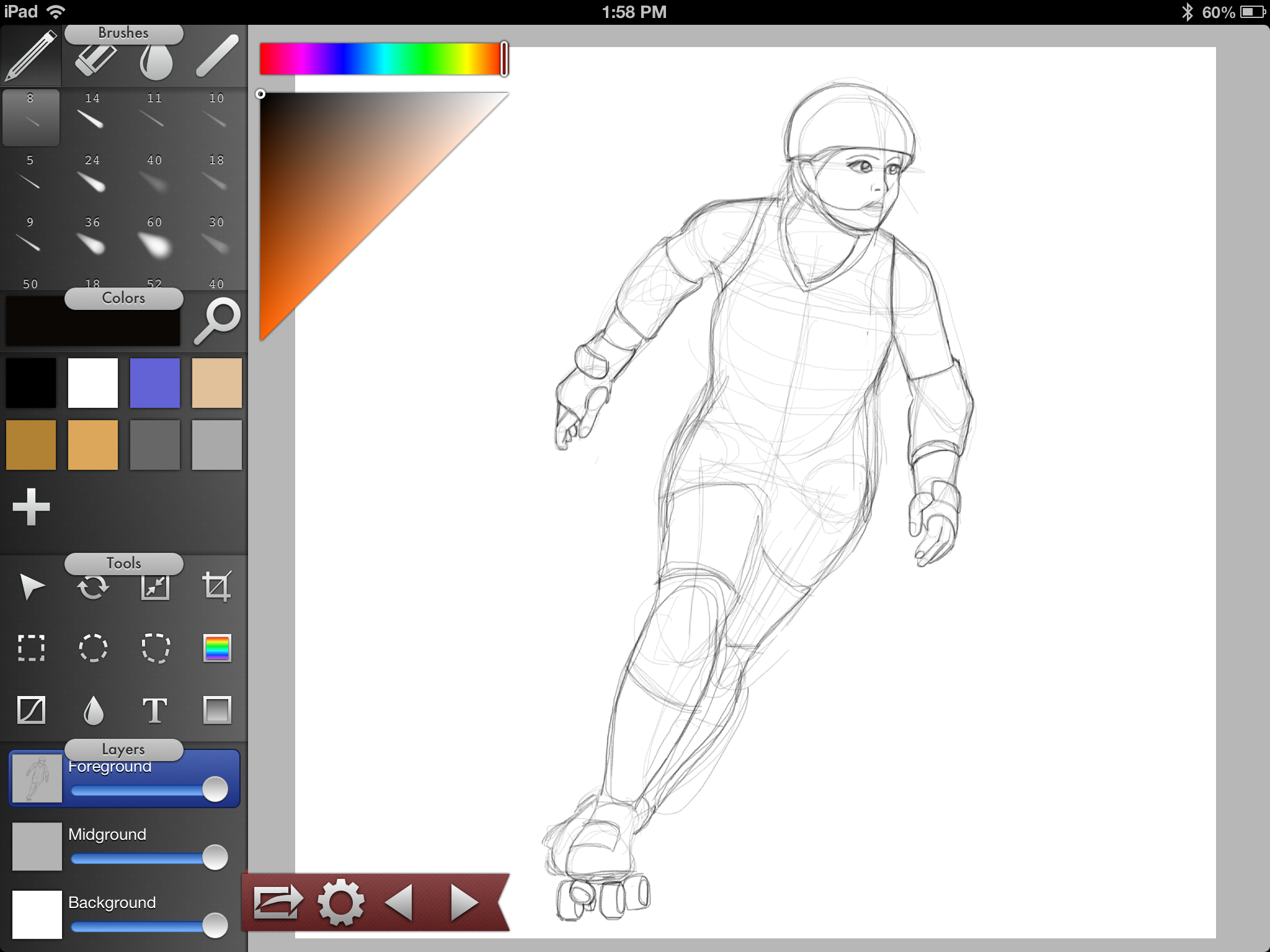
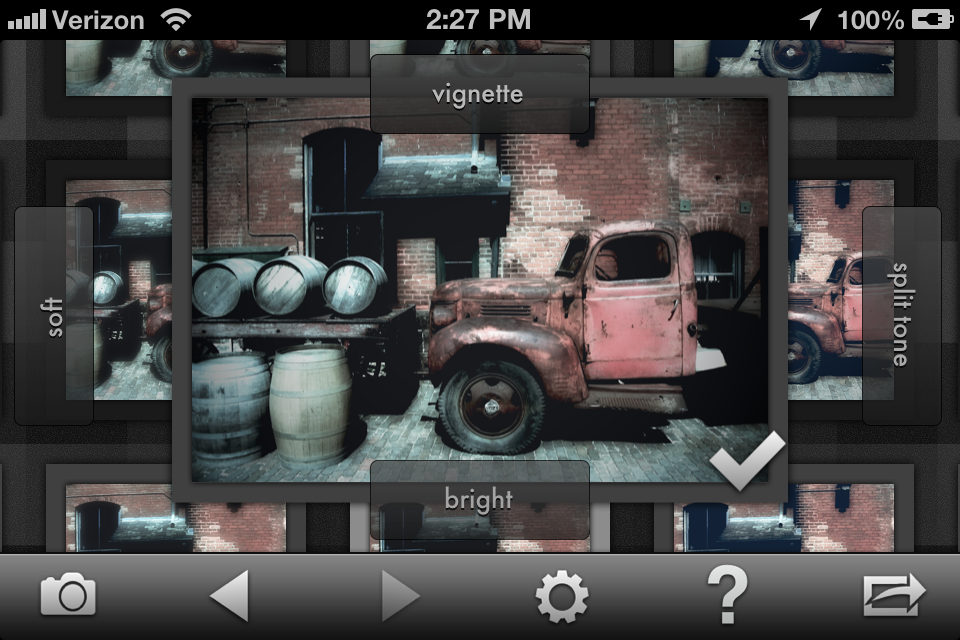
The new interface was all about simplicity. I spent less time trying to create icons for concepts like “effects” that have no readily understood pictorial representation, and instead used more text. Since text takes up more space than icons, I put the buttons on semi-transparent rectangles that wouldn’t fully obscure the image. To tie the interface to the image, I created an algorithm to create a color scheme based off whatever image was being edited*. The very initial result of the new interface concept is shown in this video I tweeted about 5 months ago.
Compared to the final version, the animation is atrocious and the spacing is poor, but it was immediately clear that the idea was a winner. From that point I made the buttons smaller and closer together to save screen space, and changed the animations to swipe in from the right when going into a menu, and push out to the right when backing out, to give a clearer sense of place. I also added overlay sheets that would attach to buttons to provide information and options in the same manner I used popovers for in previous versions. The results can be seen in my demo video here:
Please note that the poor frame rate is due to recording via airplay.
One of the most requested features I’ve received is for a way to use a mask brush without covering the area you’re brushing with your finger. The two suggested solutions were either to offset the brush from the finger, or to show the area obscured by your finger somewhere else on the screen that was visible. Filterstorm Neue solves this issue in a manner similar to the first recommendation. If you simply place your finger down and move it, the brush will follow your finger just as in older versions of Filterstorm. However, if you tap your finger, the brushing indicator will be moved without brushing. You can then grab the indicator by any edge, and drag it to move the brush which is now offset from your finger. If this description is confusing, please watch the above video as I demonstrate both methods.
Another feature I’ve long wanted to implement (also shown in that video) is the ability to go back and forth between masking and editing. Filterstorm has always had you set the filter first, then mask on the change. I’ve always thought this is better than masking before editing. However, when setting the filter for the whole image sometimes your initial perception is a little off, and once you’ve set the mask you want to increase the contrast effect, for example. In Filterstorm Neue, accepting the mask will bring you back to the contrast controls, and you can re-adjust before applying the filter. You can switch back and forth between masking and contrast as much as you like before applying. Unfortunately, there are a few features that rely on the CPU for now for which this isn’t possible, but it is for most.
Filterstorm’s been on the market for well over three years now, and I’ve learned a lot in that time. With all that extra experience, I’ve been able to build a much better engineered app that should stay fast and stable for years to come. The feature set is not yet as large as that of classic Filterstorm, but it is far faster and has a number of advantages like the ones I’ve discussed here. Future development should also bring back most of the missing features quickly. I plan to release Filterstorm Neue in early November as a new app, so please pick it up!
For more information, you can visit the website at http://filterstormneue.com
*I know some people won't want to have color in their interface, so rest assured that there is a grayscale setting.
Transitioning from Mac to iOS

When Inkist was released last May, I wrote this blog post about its creation which may be worth revisiting. In short, Inkist is how I envisioned drawing on a Cintiq (or other drawing tablet) should be. Of course, there are many people like me who enjoy drawing, but don’t have the money to buy an expensive specialized piece of equipment like that. iPads, however, are commonplace, general purpose devices that are ideal for both amateurs and travelling professionals.
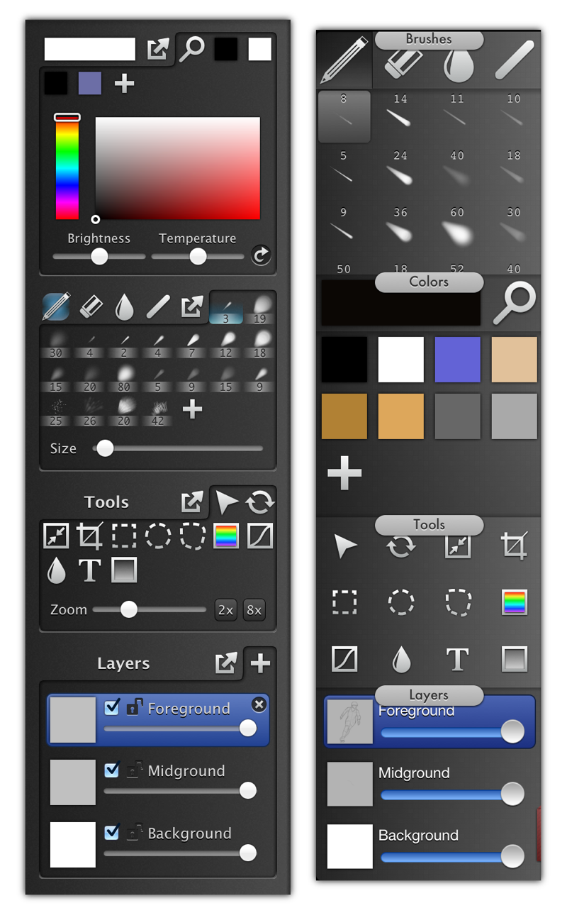
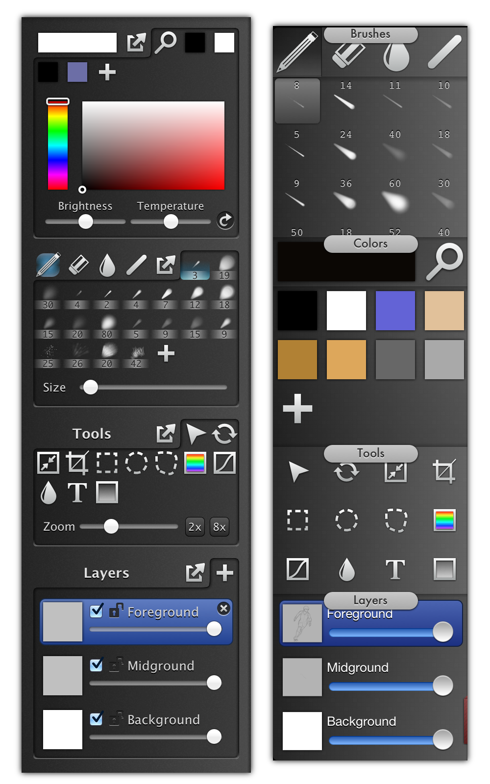
Though it’s usually a terrible idea for a Mac and iPad app to share an interface, the iPad (right) tools are little changed from the original. Since the Mac app was meant for use with pen input, it was already well suited to an iPad stylus. The buttons are based off a larger 50 point grid rather than a 30 point grid due to the fact that fingers and iPad styluses aren’t as accurate devices as Wacom digitizes, but the overall organization is unchanged.
The toolbar is a bit unusual for an iPad app. Drawing apps currently on the App Store try to minimize the screen real estate taken up by the tools in order to dedicate as much space as possible to the drawing itself. As understandable as this is, switching brushes, colors, and layers while drawing is common and needs to be easily accessible. Rather than tapping a button to reach those controls, Inkist keeps them on screen making the process faster. There is some tradeoff with drawing space, but it’s a tradeoff I wish more apps would make. iPhone’s small screen necessitates hiding features behind taps and iPad apps seem to follow suit either without enough consideration as to how much can be displayed, or in attempt to create an uncluttered look without regard to functionality.
As mentioned in my previous blog post, brush feel is of top priority for Inkist. For the most part I’ve been successful in transitioning this to iPad. With standard styluses and finger strokes, brush strokes will have a slight fading in and fading out, using the light and strong brush pressure parameters as guides. Thankfully, several third party manufacturers have begun releasing styluses using bluetooth which can report pressure information. At launch time, Inkist will support the Pogo Connect stylus with support for other pressure sensitive styluses being planned. The feel still isn’t quite as good as a Cintiq, but it’s a pretty good approximation.
Inkist for iPad is nearly ready for release on the App Store. More information on both the Mac and iOS version can be found at http://inki.st/
And the effect of App Store promotion
No matter how good your app is, you need exposure. Reviews in prominent publications and popular blogs mean a lot, some exposure can be bought through advertisements, but nothing kickstarts app sales like some promotion from the App Store itself.
How does one get this promotion? The process is opaque, but since I had no communication with Apple about Gridditor whatsoever before receiving the email requesting art assets, I can only assume that someone checks over new apps for promising candidates. Editor’s Choice/App of the week promotion requires you to send Apple some artwork given their specifications for the banner, usually with a very fast turnaround time. Getting it done in time can be trying, but the excitement of a big feature is more than worth it. “New and Noteworthy” and “What’s Hot” placements on the other hand occur without any communication whatsoever, and are always a pleasant surprise.
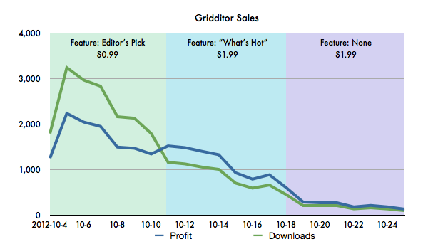
Apple updates the App Store features at approximately 3pm (New York) on Thurdays, so the the banner isn't visible for the full day. This is why sales rise on the second day.
My strategy, which I used before with Inkist, was to release at a discount ($0.99) during the feature to prioritize downloads over profits and hopefully get some word out, then to increase the price to the final $1.99 the following week. Does this strategy work? Unfortunately, there are far too many variables for me to know how much of a difference this makes. It’s possible that the vast majority who purchased in the first week at $0.99 would have still purchased at $1.99 and I’ve simply missed out on a large amount of profit. It’s also possible that the best way to launch an app is free, as Filterstorm was, in order to get that critical mass of initial users with which to spread the word.
In fact, launching as free was my initial plan, but Apple advised me to not change the price during the feature. I was too worried about missing out on profit from a full week of banner promotion to go through with it.
Regardless as to which strategy for launch is best, the power of promotion is clear. With the banner promotion I was averaging 2,400 sales a day, in “What’s Hot” that number dropped to 900 (though there was also a price increase), and the week after that went down to 215, a number that would surely be much lower without the reviews and buzz prompted by the initial feature.
Though it sold better than Filterstorm at launch, Gridditor’s sales have since slipped below those of Filterstorm. Several localizations were added to Gridditor (on 2012-10-26), which should provide some help, and I’m planning some advertising, too. It’s still unclear how Gridditor will perform in the long term, but I think there’s a large market for this type of image editor and will keep pushing.
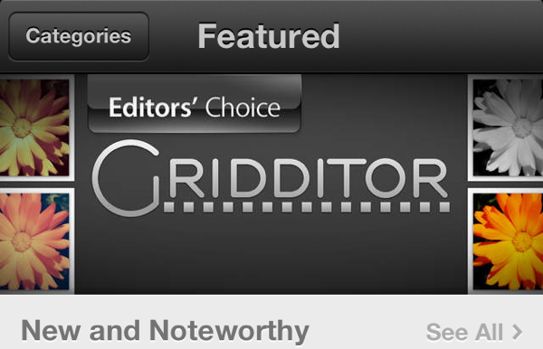
Gridditor’s promotion marks the second app launch in a row for me to get a big banner on the App Store! Thanks Apple! I hope everyone likes Gridditor. If you haven’t purchased it yet, you can buy it here [App Store Link].
The Anti-Filterstorm
Filterstorm is overkill for most people—and it should be. It was meant to be powerful, and though I try to make it as easy to use as I can, power necessitates complexity. Gridditor is the opposite. It’s the app I can tell all my friends to use regardless as to whether or not they know the first thing about photography. It is meant to be fast, easy to understand, and in some respect to teach by forcing people to look at how each filter behaves and interacts with others.
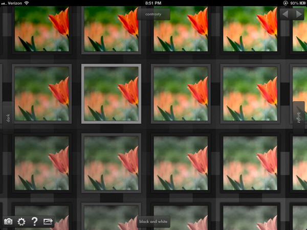
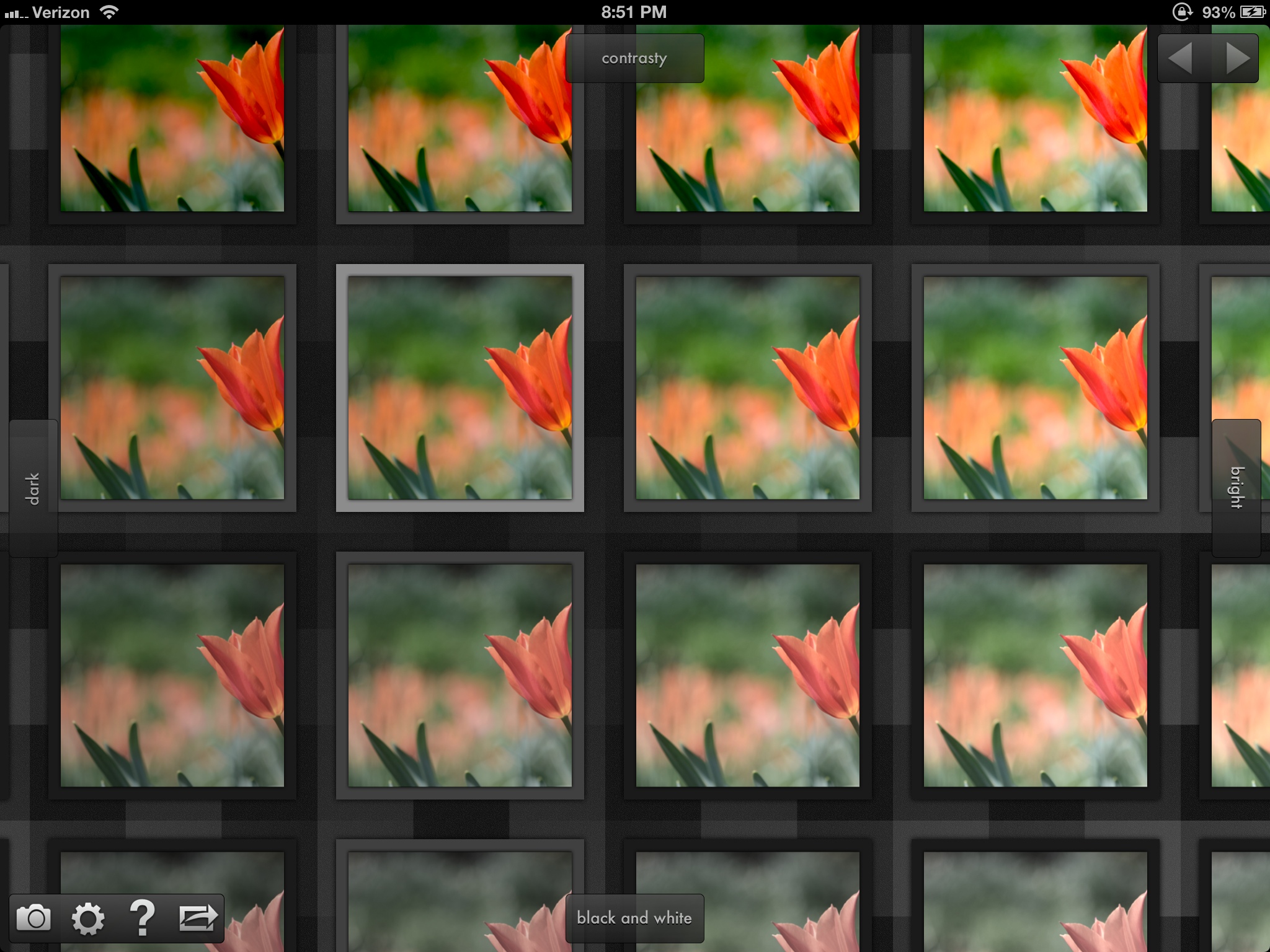
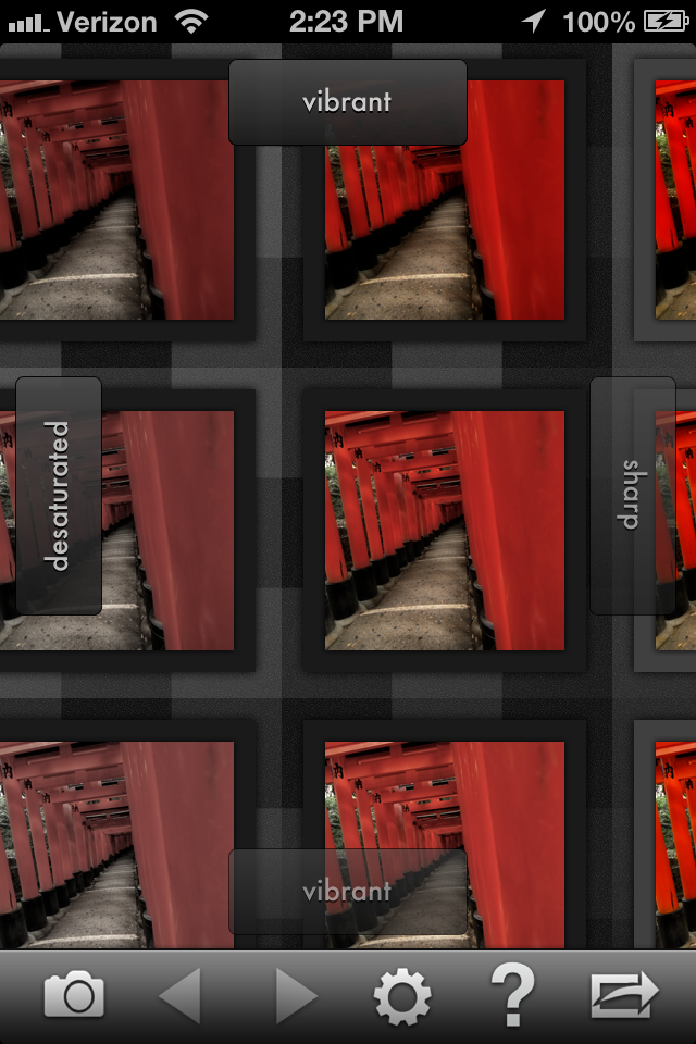
The basic premise is simple: arrange thumbnail previews in a grid, and let the user choose which one looks best (tapping on any thumbnail will bring up a larger preview). Lather, rinse, and repeat until satisfied. To generate the grid of thumbnails, I assign one filter to each cardinal direction. By default, up is contrast, down is vibrance, left is darkening, and right is brightening. If you choose a thumbnail directly to the right from the center you get that one filter, in this case brightness. If you go in two directions—say, up and to the right—then you’ll get both the brightening and the contrast filters. After a choice has been made, four new filters are pulled in at random. If the user doesn’t like the filters chosen, they can be specified manually, or a new group of random filters can be pulled in by selecting the center/unmodified image.
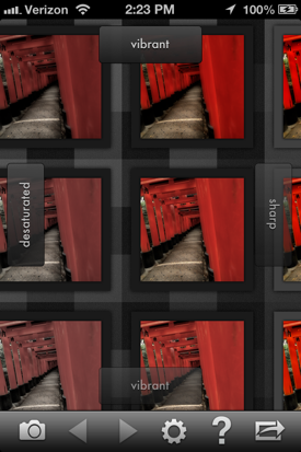
By showing a big grid of choices rather than having the user select a filter and control its strength, more options are shown at once, unexpected possibilities can arise. It also allows for very quick choice and is great for making some minor adjustments to an image before uploading it to wherever it’s headed.

I’m very excited to get Gridditor out onto the app store, and it should be available in the next couple weeks or so. In the mean time you can see the website, including a video of Gridditor in action on iPad at http://gridditor.com
All content © Tai Shimizu unless otherwise indicated.