For years I used The Omni Group’s venerable OmniWeb as my primary browser. OmniWeb had a number of features I love: thumbnail tabs, address bar text shortcuts, and integration with OS X services. Unfortunately, few people are willing to pay for a browser and The Omni Group made the very understandable decision to halt active development in 2009. I kept using it for a year or so after that but sooner or later I had to leave it behind and find a replacement.
Out with the Old…
Opera, Firefox, and Chrome all have a lot to offer, but none feel like Mac apps. All use the ugly legacy style scrollbar in Lion, and you cannot use OS X’s define word popover on website text. Safari has been the browser I’ve been using most recently. I love the back/forward scrolling in Lion and I’ve remedied the lack text shortcuts by using Alfred, but I still miss thumbnail tabs and don’t like the address bar.
…And in with the New
My browser project was initially made as a proof of concept. A week ago I tweeted a video of what I had made that day. I did it for fun — to give an idea of how I wanted a browser to look and feel so that were I to complain about the lack of a browser catering to my desires, I could point to something concrete. With WebKit handling the difficult part about writing a browser, it wasn't long before I had something usable.
I originally planned to stop the project after that day, but continued working each night after concluding work on Filterstorm. I even gave it a name. Torii.
Torii are Japanese gates that mark the entrance to shrines — the boundary between the profane regular world, and the holy. Like it’s eponym, Torii is the gateway between our world and that of the internet.
Scrolling to the previous page in Torii
The Interface
While you can hide the address bar in any browser, the interface for doing so is usually implemented as an afterthought. There may be an ugly sheet, or popup window that comes up when you access it, and it feels worse than keeping it locked to the top of the window. Really, though, there’s no good reason to keep it visible all the time.
The information it presents isn’t very useful, and since you have to click or use a keyboard command to edit it anyway, why not simply keep it off the screen until you want it? Torii does exactly that. You can use ⌘L to access it like in any other browser, or click on the tab to bring it up.
The address bar searches your history and favorites as you type, and tells you the resulting action if you hit return. Typing an address works as usual, you can type a word or phrase to search for it as in other browsers, or use a shortcut “w torii” to go directly to the wikipedia page for torii. You can use the up and down keys to scroll through the history search results, or you can use the tab button to go directly to the first history search result, saving you a precious key stroke. Back/forward controls, as well as the close button all appear when the mouse hovers over the tab, both giving them a stronger visual connection to the content they are affecting, and allowing you to use the back/forward controls on tabs in the background.
Hovering over tab shows back/forward controls
Anyone who regularly uses side thumbnail tabs knows they hold a lot of advantages over the regular sort. Even when the thumbnail is small, seeing a webs it’s color scheme can let you very quickly identify the tab you want. Scrolling with many tabs works better, as you get a list that scrolls downwards like a webpage, rather than either the rather ugly horizontal tab scrolling or list of tabs that won’t fit. Closing many tabs at once using the mouse works better, as the tabs are of uniform size and the close button for the next tab will always fall in the same place as where it was for the tab you just closed. Firefox has fixed this for horizontal tabs by making them not resize until you move the mouse away. It’s a clever solution, but not as elegant.
Tabs display loading progress
Something I haven’t before seen in a tabbing interface is using the background of the tab as a progress bar. Combined with thumbnails which update during the loading process, it gives you a very strong visual indication of the loading progress of all your tabs.
Future Plans
At this point I’m not sure where I’ll go with the project. I’m already using Torii regularly for browsing, but there are a ton of tiny details that need to get done. The download manager is barely functional, there’s no form completion, and no extension system. The Omni Group stopped developing OmniWeb for a reason. There’s a plethora of good, free browsers on the market, so why pay? The one thing that’s changed since then is the App Store, perhaps there is a market there.
I do hope to release a free public beta at some point in the near future.
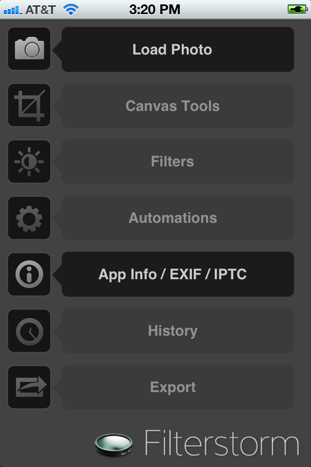
When the last major update of Filterstorm went live, I still had a day job and Filterstorm Pro was nothing more than a concept. Indeed, it was that update — version 2.5 — which prompted me to quit and allowed me the financial stability to write FSPro . Of course, this means iPhone users who have been the majority of sales since 2.5 have not seen any major update, nor any update at all since last November.
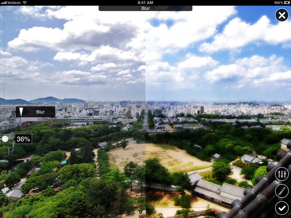
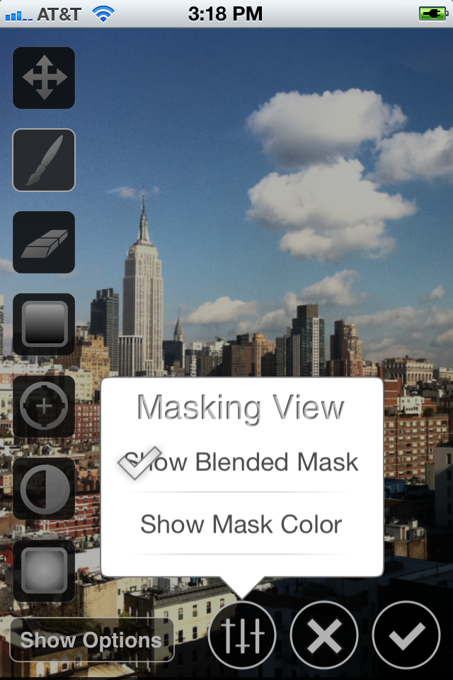
With the release of FSPro two months ago, all my time since has been spent doing two things: eliminating the launch bugs FSPro, and working on FS3. Much of this work has already found its way into FSPro. Real-time previews, blend modes, split previews, and the color overlay mask view were all part of this process. Most of the work, however, has been on the iPhone interface.
New Sliders on iPad (overlay blended blur)
Both iPad and iPhone get an entirely new interface with this release. The difference is that most of the work for iPad was already done for FSPro. Furthermore, iPhone’s interface was never nearly as good as that of iPad. The big problem was that iPad’s interface had basically been crammed in to fit on iPhone’s screen. It needed to instead be its own separate entity; it was finicky. Where the tab drawer was redesigned on iPad to be more space efficient, it needed to be eliminated entirely on iPhone. Where FSPro had kept something almost identical to FS2’s floating palette, it needed to be redesigned entirely on iPhone. In fact, I liked the new iPhone sliders so much that made a very late change (3 days ago) to the iPad interface and am now using a modified version of the new sliders there, too.
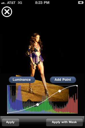
Popovers on iPhone
I decided to make my own popovers for use in FSPro rather than using the ones provided by Apple for two reasons. You can’t customize the appearance of the built-in popovers, and they can’t be used on iPhone. It was a great decision; popovers are fantastic on iPhone. They’re quicker than using modal sheets (the things that slide up from the bottom), and are perfect for displaying smaller bits of quickly-dismissed information and buttons.
Reduce the number of taps and complexity of gestures required to do anything.
Devote as much space to the image as possible
Eliminate any unnecessary color from the interface as it may distort the perception of white balance
All features should be easily discoverable
Discoverable features may have less obvious gesture-based shortcuts for power users
So did I succeed with the new interface on iPhone? Mostly. The main navigation does take slightly fewer taps to get places in FS3 than FS2. Also buttons are larger/easier to press in general, and everything looks much nicer.
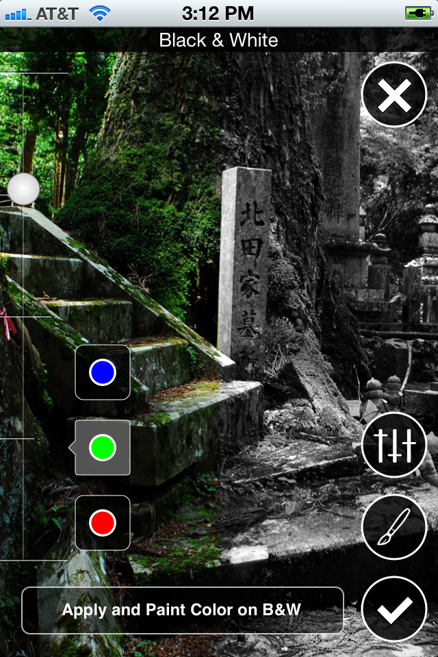
B&W sliders no longer cover half the image on iPhone
When applying filters, however, extra taps can be required to switch between slider settings. This was a tradeoff in order to accomplish goal number 2, to devote more space to the image, and the image remains big and beautiful when doing things like B&W where much of the image used to be covered. Other tools, like curves, take up the same amount of space as before, but the curve control itself is larger without covering more of the picture.
The last two points were less successful. I think things are a bit more discoverable than in FS2, the home screen labels I have added should help with that, along with better visibility of features. However, the learning curve is probably still higher than I would like it. I am always surprised when people don’t simply tap on buttons to find out what they do, and instead avoid them as they are unsure. Text documentation and videos should help with this, but there remains room for improvement.
Final Thoughts
Refinement is something I’m constantly striving for and missing. I always reach a point where the new version is much nicer than the old, and will therefore be of great value to existing users. However, this point is always well before things have truly been done right.
Apple’s behavior in this regard makes them both great and bemoaned. They famously wait to add features like copy/paste on iPhone, but (usually) get it right when they finally do. People complain that feature X doesn’t exist yet, but when it comes, feature X ends up better for the wait. I have been acting like most companies, releasing feature X when it is of benefit to the user, not when it is perfect. Filterstorm 3 has been a long time coming, but the wait has brought it towards my goal of refinement — at least a little bit.
The plan from the beginning of Filterstorm Pro was to start from scratch, importing and modifying classes from Filterstorm 2.6 as necessary. In the end, around ¼ the code is as it was in Filterstorm 2.6. The rest has been rewritten or heavily modified.
The Tabs as They First Appeared
The very first piece of code I wrote specifically for the new project was the new tab drawer. The Filterstorm drawer helped simplify things when it was introduced, but also always took up more space than I liked. FSPro’s tab drawer is much smaller, and disappears completely when previewing image adjustments or applying masks.
This is related to a few of the sometimes conflicting design goals I always keep in mind with Filterstorm.
Reduce the number of taps and complexity of gestures required to do anything.
Devote as much space to the image as possible
Eliminate any unnecessary color from the interface as it may distort the perception of white balance
All features should be easily discoverable
Discoverable features may have less obvious gesture-based shortcuts for power users
Evolution of Tabs
In keeping with these ideas, the tab drawer was shrunk, and a toolbar added for single-tap access to things not related to the content of the major tabs. Similarly, all the canvas controls require one or two fewer taps as compared to Filterstorm 2 thanks to placing the controls within the tab itself.
The filter controls, however, both in keeping with showing the maximum amount of image possible and due to the fact that only one can be applied at a time remain as in Filterstorm 2. It takes one extra tap to hide the tab drawer and brings up a hud containing the controls.
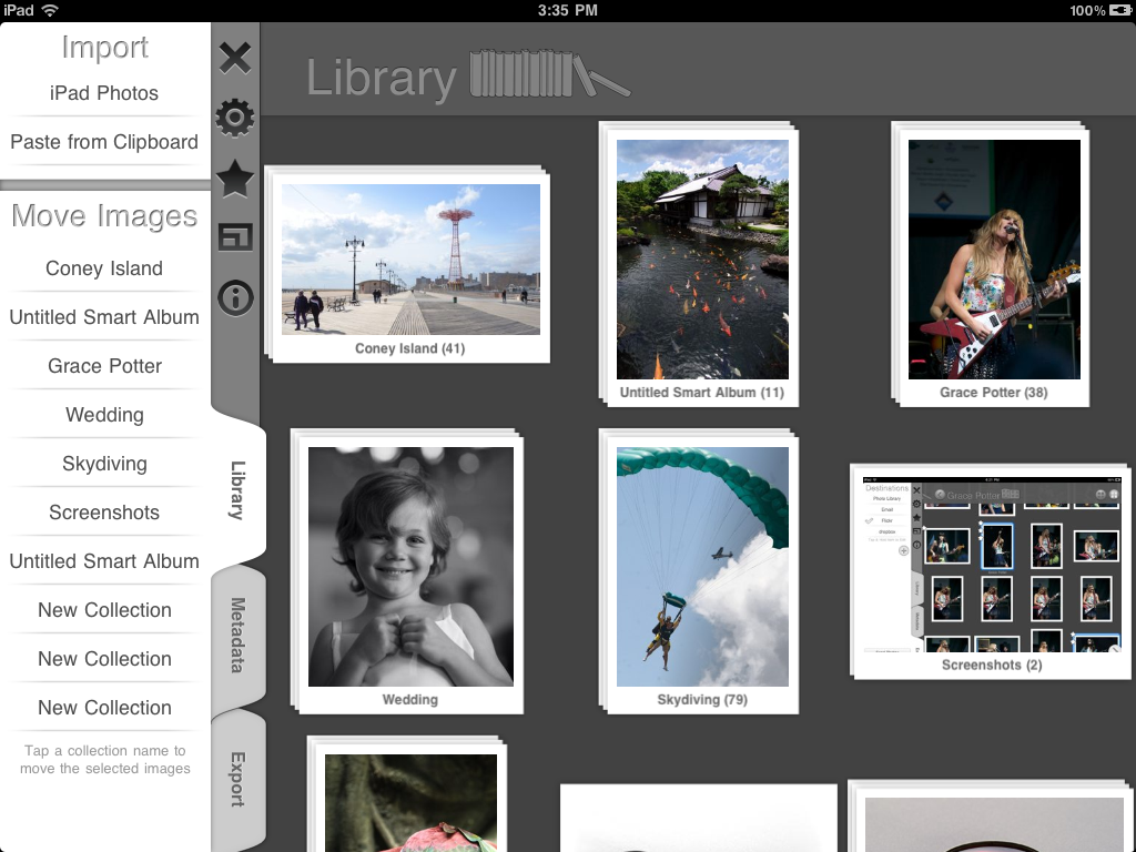
The Library
The library was built with similar design goals. One tap to select, two to open, tap and hold to see image options. You can also pinch open to get a quick fullscreen view of an image in order to quickly rate it especially when you want to decide which of similar images is best.
With the extra time of not having a day job, I was able to put a lot more time into detail. I created popovers that match the look of the app and dim the background to emphasize focus. Transition animations are much more prevalent than in Filterstorm, adding a layer of polish. I was able to create a custom photo picker showing larger thumbnails of images making it easier to find the ones you want. FSPro is — and soon Filterstorm 3 will be — far closer to my goal of the definitive iPad photo app than any previous incarnation.
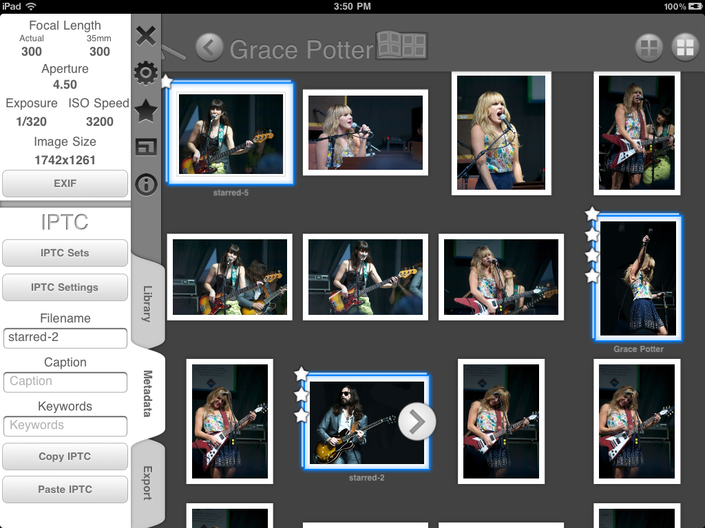
Metadata: Now a First Class Citizen
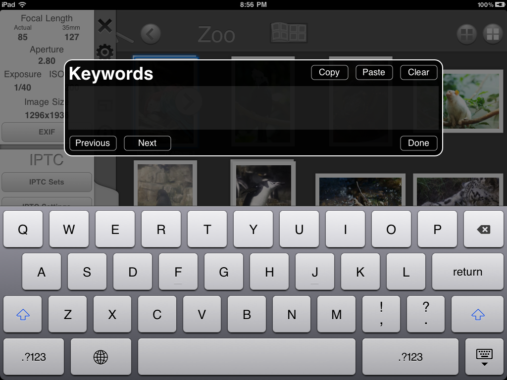
IPTC metadata was not part of Filterstorm when it was first released. It was added by request of users, but it always felt like an afterthought; this is no longer the case. Photojournalists were always in mind when creating FSPro, and I wanted to make metadata entry not only as quick as possible, but flexible enough to meet a variety of workflows. You can create presets of IPTC data to batch apply to images. You can also simply select a number of images and modify their IPTC data all at once. As everyone has different requirements as to which fields they use, you can choose which fields appear in the interface so that you can quickly see only the fields relevant to you.
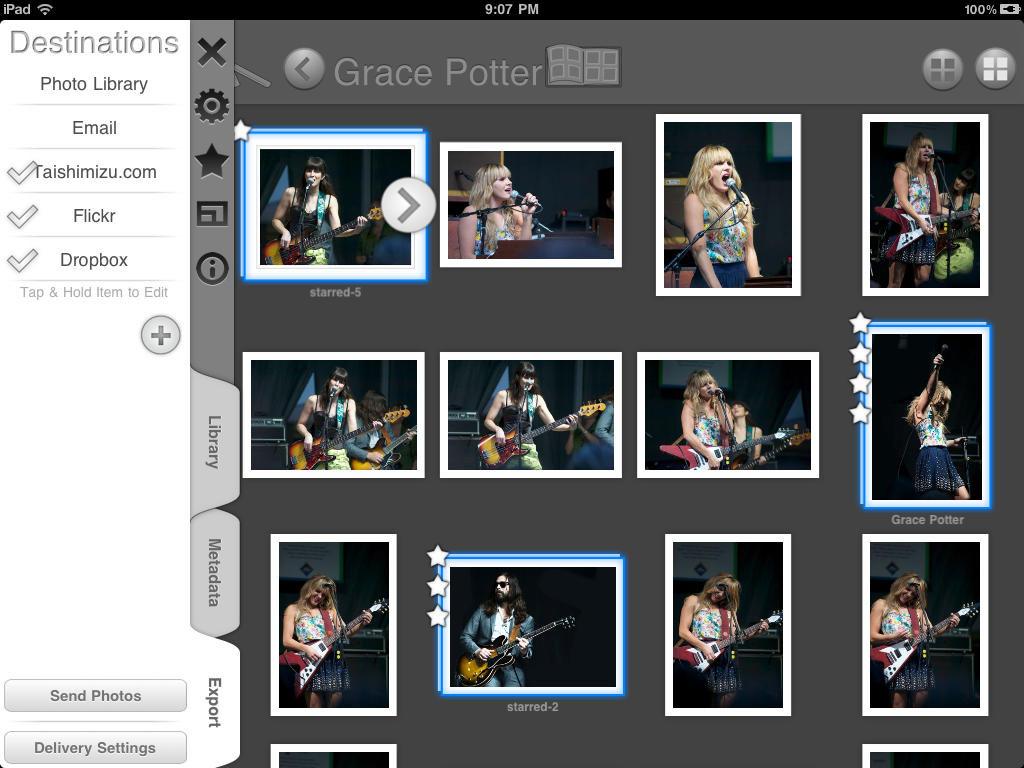
Export Redefined
Among the most vocal complaints about Filterstorm was the lack of Dropbox and Flickr export. Not only does FSPro fix this problem, but also allows you to have as many FTP export options as you like and gives you the ability to create FTP folders at the time of export. Of course there are more image services I would like to support, but FSPro has laid the foundation for adding these in the future, both for FSPro and Filterstorm 3 when it is released.
Finally I would like to thank my beta testers. They are a fantastic group of photojournalists and photo enthusiasts whose differing needs and workflows expanded my views as to how people use Filterstorm, and found numerous bugs that may have made it into the release version without them. FSPro certainly owes much to their efforts.
At this time last year, Apple had just begun reviewing iPad apps for the store. I had begun working on Filterstorm as soon as soon as the SDK was available in January, and at that time was nearly ready for submission — or so I thought.
For a long time I had wanted to write an iPhone app, but never really knew what I should do. iPad was different. The moment I saw it I wanted to write the definitive photo editor for it. It was my first iOS app and my experience with Cocoa on Mac was limited to personal projects, nevertheless I continued with my lofty goal. I submitted Filterstorm to Apple, was approved on March 31, and was live on April 1 (iPad was released on April 3).
It’s hard to overstate how stressful that month was. There were a number of memory problems that didn’t manifest in the simulator, and the speed was much, much worse than I had expected. I worked as hard as I could to fix everything. The 1.0.2 update was released onto the store just 2 days after I got my iPad. Version 1.0.3 made it onto the store 5 days after that, and 1.0.4 followed only 3 days later. Things had massively improved by 1.0.4, and I allowed a bit more time to elapse before version 1.1 was released — the first to contain new features.
Version 1.0.1 in all its glory
A year later it’s mind-boggling to think that I was working a full-time job and had 5 releases on the store in a single month.
The next few months brought several more feature updates including gradients, a price tag, and an increasingly over-crowded interface that hadn’t made much sense in the first place. Despite all this, I firmly believe Filterstorm was the most powerful photo editing app on iPad, and I had the immense pleasure of getting featured in staff favorites (80,000 free downloads) and a flattering writeup from Mac Life.
It was around this time that people started talking to me about IPTC information. Captioning was first an option in 1.4, which also brought email and FTP support. I liked the idea of Photojournalists using FS to transmit images from the road, but at this time I was busy thinking about how to make the interface clearer with version 2 and I was still working a full-time job. That market wasn’t — and couldn’t be — my real target at the time.
Version 2.0
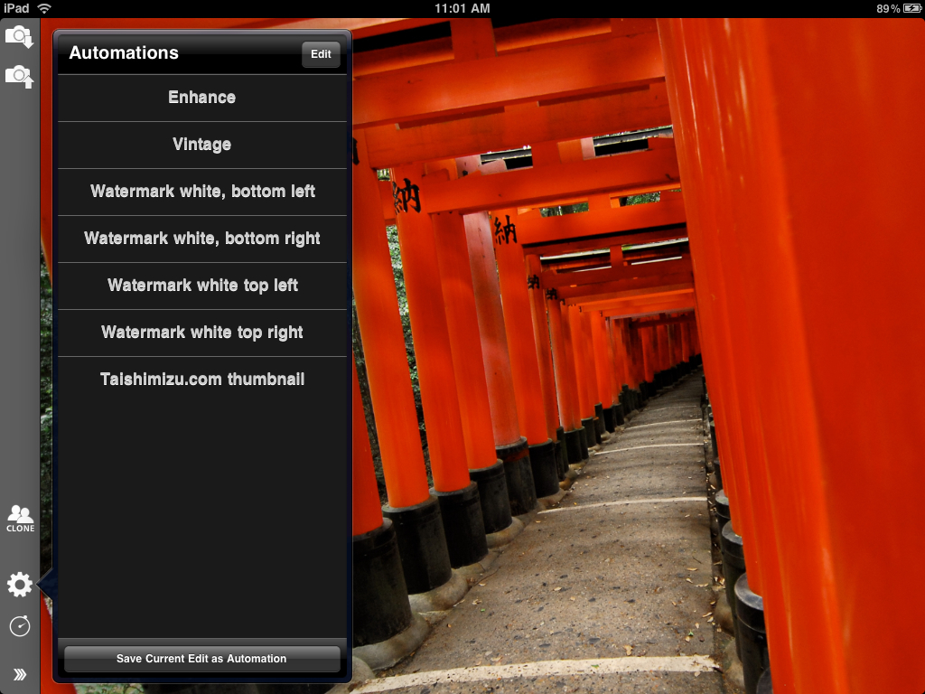
Version 2.0 was released in mid-August. It brought the now-familiar basic interface layout (the drawer), large image reprocessing, and automations. It was met with mixed reactions; the new interface was clearer, but also took up more space, especially as controls for curves, hue, etc. appeared within the drawer rather than floating HUDs. It wasn’t very pretty, but it was much more capable.
iPhone, Finally.
I immediately started working on the iPhone version after 2.0 was done. The iPhone market was crowded, but everyone wanted an iPhone version, myself included. I had a lot of trouble scaling the interface down to the tiny screen, and while I am extremely happy that I was able to maintain all the features from the iPad version, I’ve never been very satisfied by how finicky it is on the tiny screen.
This was, though, the proverbial straw to the camel. I had been making slightly more money on Filterstorm than at my job since it launched, but money from iPhone sales turned the security of my day job into a liability eating away at my programming hours. I gave notice a couple weeks later, on October 1, and worked my last day on October 30.
By this time I knew I was going to write Filterstorm Pro. My original goal with Filterstorm was to make the definitive iPad photo editing software. With the iPhone version out — and after several conversations with photojournalists — I expanded that goal to encompass mobile photography workflow.
My first month of freedom was spent making sure that everything was working well with the regular version so that I could concentrate on FSPro with a minimum of distractions. With that out of the way, (and some time off to work on Light Compressor), I was finally able to concentrate on Pro.
—
I was originally going to write this all in one chunk, but that took longer than expected. Tomorrow (hopefully) I’ll post about the development of Filterstorm Pro.
 Something I haven’t before seen in a tabbing interface is using the background of the tab as a progress bar. Combined with thumbnails which update during the loading process, it gives you a very strong visual indication of the loading progress of all your tabs.